Schiaccamatta
Rebrand
Brand Identity | Adobe InDesign | Adobe Illustrator | 2024
Schiacciamatta is a sandwich shop in Florence, Italy that makes Tuscan-style paninis using local ingredients and schiaccata, a local type of bread. This project was for a branding design class I took while studying abroad in Florence, and the goal was to create a new logo and brand identity for a local business of our choosing. The outputs of this project were to create a new logo, type study, color palette and a variety of stationary items.

Brainstorming
Schiacciamatta is a sandwich shop in Florence, Italy, known for its Tuscan-style paninis made with local ingredients and schiacciata, a traditional Tuscan flatbread. As part of a branding design class during my time studying abroad in Florence, I began by brainstorming the shop’s identity, exploring its name, its food, and its connection to local culture. I looked at the meaning behind “schiacciamatta,” or “crazy bread,” as well as the ingredients, traditional Tuscan flavors, and visual elements associated with Florence. This initial exploration included ideas inspired by rustic food illustrations, traditional Florentine iconography, and the shop’s local, unpretentious character. These sketches and notes helped me identify key themes and visual directions to explore when developing a new logo and brand identity for the business.
Re-imagining a Logo
For the logo, I wanted to combine the letter S from Schiacciamatta with the shape and concept of a sandwich. I experimented with symmetrical, geometric forms to create a distinctive symbol that could communicate both the product and the brand name. Alongside the icon, I explored humanist sans-serif typefaces, testing different weights and arrangements to find a balance between a playful, approachable personality and a bold, recognizable wordmark. The goal was to create a cohesive visual identity that reflects the local sandwich shop while remaining simple, versatile, and memorable.


Logo Design & Alternatives
The design I landed on incorporated the S as to mimic the pieces of flat bread for the panini and the spine of the S being made of circles representing the components of the sandwiches.
Each additional design has a direct symbolic meaning tied to the origin and function of Schiacciamatta. The orange fill on the curvature of the S represent the schiaccatta bread native to Tuscany and used in all sandwiches. The dark red (same as final logo) represents drops and bubbles within the deep red chianti wine served. Green and pink represent ingredients in a schiacciamatta sandwich such as arugala and tuscan salami. The yellow represents the big bubbles in the schiaccatta bread.


Packaging
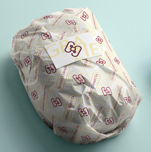
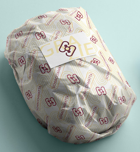
I developed a repeating pattern using retro-inspired shapes to reinforce the shop’s name and evoke its traditional Tuscan character. The inverted rounded corners featured throughout the design were inspired by Schiacciamatta’s original storefront, creating a subtle link to the shop’s existing identity. Having noticed that many sandwich shops in Florence used branded patterns on their wrappers, I wanted to incorporate this detail into the packaging to create a more authentic feel and extend the visual identity across every brand touchpoint, ensuring a cohesive and recognizable look.


Business Cards
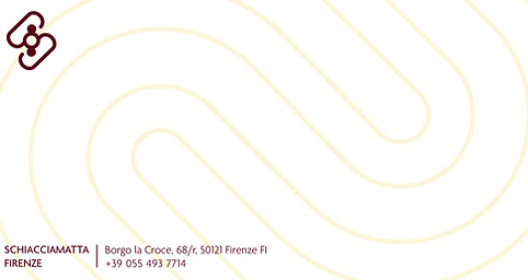
For the business cards and other stationery, I incorporated generous white space and retro-inspired shapes to emphasize the shop’s name while reflecting its traditional Tuscan character. The inverted rounded corners of the framing element were inspired by Schiacciamatta’s original storefront, creating a subtle visual connection to the business’s existing identity and giving the designs a more personal, place-specific feel.
Letterhead


Envelope