
Big Artist Corp.
Adobe Illustrator, InDesign | Print & Advertisement | Hands-on Event Planning | 2026
Big Artist Corp (BAC) is a group of 8 (including myself) co-founding emerging artists out of Cal Poly, SLO whose creation was inspired by the need for an independent art show from the university in order to reach a wider audience, learn about professional gallery logistics including insurance, handling sales, fundraising, etc. The art show was a huge social and commercial success in the San Luis Obispo area, with stories written in local news. My primary role within this project was on the marketing and visual design of our organization, "Big Artist Corp" as well as the show we put on entitled, "This is Not a Couch" a nod to the Rene Magritte painting, "The Treachery of Images".

This way for more


Concept
We named ourselves Big Artist Corp as a tongue-in-cheek nod to the vastness of the contemporary and commercial art worlds we were entering. From the beginning, BAC was conceived as an independent, guerilla-style art platform, so we wanted the visual identity to feel bold, simple, and adaptable.
For the logo, we chose a stylized wordmark built around a geometric design. The simplicity of the form allows it to stand on its own while also giving us a flexible visual language that can evolve and adapt across different themes, exhibitions, and future shows.
The Couch
After a full school year of late-night studio sessions, shared meals, group critiques, and countless hours spent working alongside one another, we developed a strong connection to our shared studio, a home away from home. At the centre of that space was a blue couch that had seemingly been there forever. Its history was unknown, but its significance to us was unmistakable. It became a place for everything: conversations, critiques, meals, naps, and moments of rest between making. While each of our artistic practices explored different subjects, materials, and processes, the studio, and particularly the couch, became the thread that connected us.
In keeping with the irony at the heart of BAC, we wanted the exhibition to acknowledge both the student-led and guerilla nature of the project while referencing a landmark work of modernist art: René Magritte’s The Treachery of Images. Magritte’s famous declaration, “Ceci n’est pas une pipe” (“This is not a pipe”), plays with the relationship between an object, its representation, and the language we use to describe it.
Taking this idea as a starting point, we each created our own interpretation of the studio couch, using our individual artistic practices to reimagine the same shared object. Together, the works became This Is Not a Couch.


Color & Typography
The color palette reflects the painting with the aged white ivory background in the original painting. We named this background color for the posters canvas, and the blue tones of the couch after studio favorite blue pigments of paint, ultramarine blue and cobalt blue.
The title, This is not a couch. was meant to replicate the hand-painted phrase on the painting The Treachery of Images, and what was chosen as the closest is a humanist cursive typeface, with open counters in the lowercase a and p. Though on the chosen typeface, the extension tails on the s and t are longer and the overall stroke weight is thicker.
We used the same typeface used in the logo for Big Artist Corp and for the subtitles and text in the poster designs for This is not a couch. The pairing of the large lowercase curving title with a more geometric uppercase subtext creates balance.
Advertisement
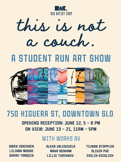
I developed a series of promotional posters inspired by the original painting’s colour palette and typography. At the centre of the design was a composite image combining all of our individual couch illustrations into a single couch. This brought together our different interpretations of the same object, highlighting the distinct styles of each artist while visually unifying them within one exhibition.
I chose to centre-align the typography throughout the posters, allowing the Big Artist Corp logo to sit prominently at the top of the composition. Alongside the main posters, I created a series of individual posters featuring each artist’s couch, introduced with a simple “featuring” treatment. Together, these posters created a consistent visual identity while giving each artist and their work a moment of focus.
We printed hundreds of small poster copies and distributed them throughout the university campus and across San Luis Obispo. With the storefront secured only a few weeks before the exhibition, we also installed signage in the windows as soon as possible, turning the empty space into an early point of visibility and helping build anticipation among passersby.




Introducing BAC
To introduce BAC and the concept behind the show, we created a social media presence where we began sharing videos documenting our time in the studio. These posts gave people an inside look at the process and helped us begin building an audience around the project.
As we continued spreading the word, our following grew and the project began to gain momentum. We also launched a crowdfunding campaign, through which we received several generous donations that helped cover the rent and production fees for the exhibition. The show was ultimately held in an empty storefront in downtown San Luis Obispo, transforming an otherwise unused commercial space into a temporary home for our work and bringing the project from the studio into the public sphere.
The Event
For the opening of This Is Not a Couch, I used window paint to create a bold, high-contrast sign across the front of our rented storefront. The signage helped transform the otherwise empty space into a visible gallery and introduced the exhibition to the surrounding community. Many passersby watched us preparing the space in the days leading up to the opening, and some returned on opening night to see the finished exhibition.
The opening welcomed more than 200 visitors, including family and friends, university faculty, local news reporters, fellow students, and members of the wider San Luis Obispo community. We intentionally scheduled the exhibition to coincide with graduation weekend, not only so our families could attend, but also to take advantage of the influx of visitors moving through the city and past our gallery.


