

Sasquatch
Skedaddle
Adobe Illustrator & InDesign | Print & Advertisement | 2025
Backcountry Squatters is a non-profit based in Bozeman, Montana whose mission is to provide a space and communtiy for women, non-binary people and members of the LGBT+ community. There are 16 chapters of Backcountry Squatters at universities all around the United States. Every fall, the non-profit organizes a fundraising running race where there are 1mile, 5K, & 10K races. I was chosen to design the digital marketing campaign, with a logo, emblem, banners and mockups for the organization to use to advertise the event. To learn more about Backcountry Squatters, visit their website: www.backcountrysquatters.org
COLOR PALETTE
Having taken a look at past year's designs for the Sasquatch Skedaddle branding, I created a more updated color palette that matched the mood of the brand and incorporated earth tones. The previous year's color palette included warm fall colors such as orange, light brown and yellow. Having started with the two green tones, the light pink allows for some complimentary contrast as well as provides a mid-tone in grayscale.
2f4541
c6c44c
d88c9a
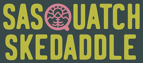

WORDMARK STUDY
The Backcountry Squatters team requested that I make sure the design for the wordmark stay as true as possible to the existing BCS logo, including the emblem and the typeface used. I decided on the solution that used the font Logbond and incorporated the emblem into the 'Q' within the word 'Sasquatch'. After using the colors from the selected color palette, we were left with something that felt it matched the mood of the organization better than previous years designs, but also felt new and refreshing. Using the secondary font from the logo as the primary font in the wordmark allowed for the BCS logo to still stand out when placed together, but due to the thick stroke weight of Logbond, it doesnt overpower the Sasquatch Skedaddle wordmark. We also decided to include 2025 as a part of the main wordmark.
COMBINED LOGO
For advertising the event, we needed to include the existing Backcountry Squatters logo in order to tie it all together. I wanted to keep the hierarchy focused on the title with the secondary color (light green) and tertiary color (pink) tieing the viewers eye in before guiding it up to the organization's logo. We also included the race distances in order to drive home the idea of the fundraiser being tied to the runs.


EMBLEM
To stay true to the name of the event, the BCS team wanted me to include a Sasquatch in the logo, though they wanted to make it more feminine. I came up with different versions of the Sasquatch, keeping the general shape and movement of the illustration simple in order for the emblem to both be viewed big and small. I then combined the figure with a flower and vine, to show it both running but also holding the flower, encouraging the viewer to take part in the event regardless of being competitive in addition to making it more feminine and friendly. Here is the final version used in the social media marketing as well as all other banners used for the event. It is easily scalable, works in black and white and makes great use of the selected color palette.
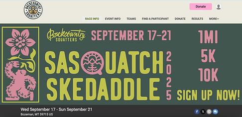
SIGN UP BANNER
Backcountry Squatters included the banner I created with the composite logo, emblem and dates on their official website in order to advertise the event and to encourage viewers to sign up for the event. Above features the banner itself, and below the feature on the BCS website.


FACEBOOK BANNER
Below shows the banner created for the official Facebook (Meta) page for during the event, in order to advertise signing up to viewers on their profile page. The other image shows the post created for the event to notify followers and make their social media feed more cohesive.

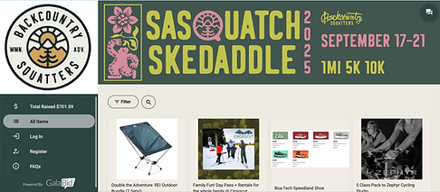
GALABID BANNER
Since the Sasquatch Skedaddle was a fundraiser for the organization, a GalaBid profile was created to encourage viewers and participants to help raise money to support, as well as take advantage of deals for fun outdoor gear for future adventures. Featured is the banner itself as well as how it appeared on the official GalaBid page.


MERCH
For participants in the event, merchandise was available for purchase such as hoodies and t-shirts. Shown are mockups with the BCS logo in the selected color palette along with the emblem. The BCS team adored the emblem and wanted it to be front and center, so we decided to make it blown up on the back of the merch in order to make it not only fun event-ware but also encourage buyers to wear it in the future.

